Chapter 1
Tool bar and dialog bar are used extensively in all types of applications. They provide users with a better way of executing application commands. Generally a tool bar comprises a series of buttons; each button represents a specific command. A command implemented by the tool bar can be linked directly to a menu command, in which case the two items share a same command ID. Both menu and tool bar handle WM_COMMAND message for executing commands. Besides, they also handle UPDATE_COMMAND_UI message to set the state of a button or a menu item. In fact, this message is very effective in enabling, disabling, and setting checked or unchecked state for a command.While tool bar usually contains bitmap buttons, dialog bar can include many other type of controls that can be used in a dialog box, such as edit control, spin control, etc. Both tool bar and dialog bar can be implemented either as floated or docked, this gives users more choices in customizing the user interface of an application.
In MFC, classes that can be used to implement the tool bar and dialog bar are CToolBar and CDialogBar respectively. Both of them are derived from class CControlBar, which implements bar creation, command message mapping, control bar docking and floating (both tool bar and dialog bar are called control bar). Besides the default attributes, class CToolBar further supports bitmap button creation, automatic size adjustment for different states (docked or floated). A dialog bar can be treated as a dialog box (There is one difference here: a dialog bar can be either docked or floated, a dialog box does not have this feature): its implementation is based on a dialog template; all the common controls supported by dialog box can also be used in a dialog bar; their message mapping implementations are exactly the same.A standard SDI or MDI application created by Application Wizard will have a default dockable tool bar. From now on we will discuss how to add extra tool bars and dialog bars, how to implement message mapping for the controls contained in a control bar, and how to customize their default behavior.
When using Application Wizard to generate SDI or MDI application skeleton, we can ask it to create a default docking tool bar for us. This can be done in the step 4 (see Figure 1-1). The default tool bar shares the same ID with the mainframe menu. It has eight bitmap buttons, which are all shortcuts to the menu commands. After executing this application, we will see a tool bar docked to the top border of the mainframe window. By using the mouse, we can easily either float it or dock it to other borders.
The tool bar resource can be opened in the Developer Studio. If we click "ResourceView" tab at the bottom of "Workspace" window, all the resources being used by the application will be listed within the window. If we asked Application Wizard to add a default tool bar for us, we will see a "Toolbar" resource node. By expanding this node (clicking on "+" node button or double clicking on the label), we will see all tool bar resources used by the application. If we double click on "IDR_MAINFRAME" ID, the tool bar bitmap will be displayed in "Tool Bar Edit" window. We can edit or delete an existing bitmap (each bitmap will be used to create a bitmap button). We can also add new bitmaps and assign them command IDs. When doing this, we can either use an existing menu command ID or a newly created one. In the latter case, we need to implement message mapping afterwards.The Application Wizard does an excellent job in adding a very powerful tool bar. Nevertheless, as a programmer, we are kept from knowing what makes all these happen. If we need to make changes to the default tool bar (for example, we want it to be docked to the bottom border instead of top border at the beginning), which part of the source code should we modify? Obviously, we need to understand the essentials of tool bar implementation in order to customize it.
Like menu, generally tool bar is implemented in the mainframe window. When creating a mainframe menu, we need to prepare a menu resource, use class CMenu to declare a variable, then use it to load the menu resource. Creating a tool bar takes similar steps: we need to prepare a tool bar resource, use class CToolBar to declare a variable, which can be used to load the tool bar resource. After the tool bar resource is loaded successfully, we can call a series of member functions of CToolBar to create the tool bar and customize its styles. After creating a standard SDI or MDI application using Application Wizard (with "Docking toolbar" check box checked in step 4, see Figure 1-1), we will find that a CToolBar type variable is declared in class CMainFrame: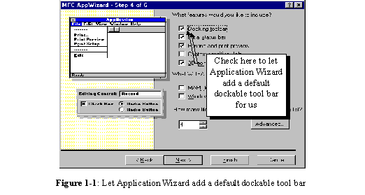
class CMainFrame : public CFrameWnd
{
……
protected: // control bar embedded members
CStatusBar m_wndStatusBar;
CToolBar m_wndToolBar;
……
}
The newly declared variable is m_wndToolBar. By tracing this variable, we will find out how the tool bar is implemented. Tool bar creation occurs in function CMainFrame::OnCreate(…), where the mainframe window is being created. Tool bar is created after function CFrameWnd::OnCreate(…) is called, which creates the default mainframe window. Creating a tool bar takes following steps:The following lists necessary steps of implementing message mapping:
Most of the time message mapping could be implemented through using Class Wizard. In this case we only need to select a command ID and confirm the name of message handler. Although Class Wizard does an excellent job in implementing message mapping, sometimes we still need to add it manually because Class Wizard is not powerful enough to handle all cases.
Now that we understand how the default tool bar is implemented, it is easy for us to add extra tool bars. We can declare CToolBar type variables in class CMainFrame, create tool bars and set their styles in function CMainFrame::OnCreate(…). Then we can map tool bar command IDs to member functions so that the commands can be executed by mouse clicking.Sample 1.1-1\Bar and 1.1-2\Bar demonstrate the above procedure. In the two applications, apart from the default tool bar, an extra tool bar that has four different buttons is added. Each button is painted with a different color: red, green, blue and yellow. If we click on one of them, a message box will pop up telling us the color of the button.
First we need to use Application Wizard to create a standard SDI application named "Bar", leaving all the settings as default. This will generate an application with a mainframe menu, a dockable tool bar and a status bar. The default four class names are CBarApp, CMainFrame, CBarDoc, CBarView.Before modifying source code to add the second tool bar, we need to prepare the tool bar resource. In order to do this, we need the following steps to create a tool bar resource that contains four bitmap buttons:
……
……
The new variable is m_wndColorButton, it is added right after other two variables that are used to implement the default tool bar and status bar.
Next, we can open file "MainFrm.cpp" and go to function CMainFrame::OnCreateClient(…). In Developer Studio, the easiest way to locate a member function is to right click on the function name in "WorkSpace" window, then select "Go to Definition" menu item from the popped up menu. Let’s see how the default tool bar is created:……
if (!m_wndToolBar.Create(this) ||
!m_wndToolBar.LoadToolBar(IDR_MAINFRAME))
{
TRACE0("Failed to create toolbar\n");
return -1;
}
……
Function CToolBar::Create(…) is called first to create the tool bar window. Then CToolBar::LoadToolBar(…) is called to load the bitmaps (contained in tool bar resource IDR_MAINFRAME). When calling function CToolBar::Create(…), we need to specify the parent window of the tool bar by providing a CWnd type pointer (Generally, a tool bar must be owned by another window). Because this function is called within the member function of class CMainFrame, we can use "this" as the pointer of parent window.The following code fragment shows how the styles of the default tool bar are set:
m_wndToolBar.SetBarStyle
(
m_wndToolBar.GetBarStyle() | CBRS_TOOLTIPS | CBRS_FLYBY | CBRS_SIZE_DYNAMIC
);
Function CToolBar::SetBarStyle(…) sets tool bar’s styles, which can be a combination of different style flags using bit-wise OR operation. Because we do not want to lose the default styles, first function CToolBar::GetBarStyle() is called to retrieve the default tool bar styles, then new styles are combined with the old ones using bit-wise OR operation. In the above code fragment, three new styles are added to the tool bar: first, flag CBRS_TOOLTIPS will enable tool tips to be displayed when the mouse cursor passes over a tool bar button and stay there for a few seconds; second, flag CBRS_FLYBY will cause the status bar to display a flyby about this button (For details of tool tip and flyby, see section 1.11); third, flag CBRS_SIZE_DYNAMIC will allow the user to dynamically resize the tool bar, if we do not specify this style, the dimension of the tool bar will be fixed.The following statement enables a dockable tool bar:
m_wndToolBar.EnableDocking(CBRS_ALIGN_ANY);
Function CToolBar::EnableDocking(…) makes the tool bar dockable. Here, flag CBRS_ALIGN_ANY indicates that the tool bar may be docked to any of the four boarders of the frame window. We may change it to CBRS_ALIGN_TOP, CBRS_ALIGN_BOTTOM, CBRS_ALIGN_LEFT, or different combinations of these flags, whose meanings are self-explanatory. The dockable tool bar still can’t be docked if the frame window does not support this feature. We must call function CFrameWnd::EnableDocking(…) to support docking in the frame window and call CFrameWnd::DockControlBar(…) for each control bar to really dock it. The following code fragment shows how the two functions are called for the default tool bar:Like function CCtrlBar::EnableDocking(…), CFrameWnd::EnableDocking(…) uses the same parameters to specify where a control bar is allowed to be docked.
We need to do the same thing for the newly declared variable m_wndColorButton. We can call the above-mentioned functions to create tool bar window, set its styles, enable docking, and dock it. The following code fragment shows the updated function CMainFrame::OnCreate(…):int CMainFrame::OnCreate(LPCREATESTRUCT lpCreateStruct)
{
if (CFrameWnd::OnCreate(lpCreateStruct) == -1)
return -1;
if (!m_wndToolBar.Create(this) ||
!m_wndToolBar.LoadToolBar(IDR_MAINFRAME))
{
TRACE0("Failed to create toolbar\n");
return -1;
}
if (!m_wndColorButton.Create(this) ||
!m_wndColorButton.LoadToolBar(IDR_COLOR_BUTTON))
{
TRACE0("Failed to create toolbar\n");
return -1;
}
if (!m_wndStatusBar.Create(this) ||
!m_wndStatusBar.SetIndicators(indicators,
sizeof(indicators)/sizeof(UINT)))
{
TRACE0("Failed to create status bar\n");
return -1;
}
m_wndToolBar.SetBarStyle(m_wndToolBar.GetBarStyle() |
CBRS_TOOLTIPS | CBRS_FLYBY | CBRS_SIZE_DYNAMIC);
m_wndToolBar.EnableDocking(CBRS_ALIGN_ANY);
m_wndColorButton.SetBarStyle(m_wndColorButton.GetBarStyle() |
CBRS_TOOLTIPS | CBRS_FLYBY | CBRS_SIZE_DYNAMIC);
m_wndColorButton.EnableDocking(CBRS_ALIGN_ANY);
EnableDocking(CBRS_ALIGN_ANY);
DockControlBar(&m_wndToolBar);
DockControlBar(&m_wndColorButton);
return 0;
}
By compiling and executing the sample application at this point, we can see that the tool bar has been created. The tool bar can be docked to one of the four borders of the mainframe window or be floated. If we dock the tool bar to either left or right border, we will see that the tool bar will automatically have a vertical layout. This feature is supported by class CToolBar, we don’t need to add any line of code in order to have it.The new tool bar looks very disappointing. Although we made much effort to add it, none of its buttons can be used to execute command. This is because we still haven’t implemented any message handler for the new commands, therefore the buttons will be disabled all the time.
In Windowsä applications, commands are executed through sending WM_COMMAND message. As the user clicks a menu command or a tool bar button, the system will send a WM_COMMAND message to the application. All the Windowsä messages have two parameters, WPARAM and LPARAM (They are nothing but two integers, as an application receives a message, it will also receive the message parameters). For WM_COMMAND message, its WPARAM parameter is used to store the control ID (Command ID, such as ID_BUTTON_RED in our samples), which can be examined by the application to make appropriate response. If an application has callback function, we can process message WM_COMMAND within it. A general callback function for this purpose looks like the following:LONG APIENTRY CallBackProc
(
{
……
break;
}
case WM_COMMAND:
{
switch(wParam)
{
……
……
……
}
break;
}
……
}
There are many types of messages, so parameter message (second parameter of the above function) could be any of the predefined values. If we want to trap mouse clicking events on the tool bar buttons, we need to handle WM_COMMAND message. We can see that within the WM_COMMAND case of switch statement in the above example, parameter wParam is checked (It holds WPARAM parameter of the message). By comparing it with the IDs of our buttons, we are able to find out which command is being executed by the user.MFC handles Windowsä message in a different way. Because MFC applications are built upon classes, it is more convenient to handle messages within class member functions instead of one big callback function. In MFC, this is achieved through message mapping: we can implement the functions that will be used to execute commands, and use macros defined in MFC to direct the messages into these member functions.
As mentioned before, doing message mapping generally takes three steps: declaring afx_msg type member functions, using ON_COMMAND and ON_UPDATE_COMMAND_UI macros to implement mappings, and implementing the member functions. For WM_COMMAND type message, the message handling functions do not have any parameters and should return void type value (For other type of messages, the format of the functions may be different). The message mapping can be implemented by using ON_COMMAND macro, which has the following format:ON_COMMAND(control ID, member function name)
For example, if we have a member function OnButtonRed() in class CBarDoc, and we want to map WM_COMMAND message to this function when the user clicks red button (whose ID is ID_BUTTON_RED), we can implement message mapping as follows:BEGIN_MESSAGE_MAP(CBarDoc, CDocument)
ON_COMMAND(ID_BUTTON_RED, OnButtonRed)
END_MESSAGE_MAP()
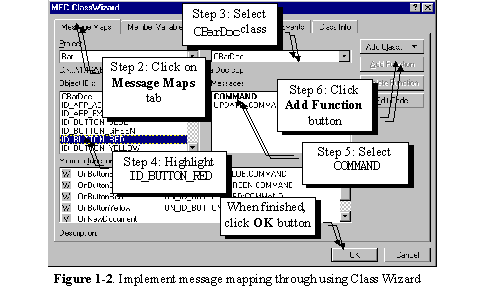
Message mapping macros must be done between BEGIN_MESSAGE_MAP and END_MESSAGE_MAP. Please note that if we want member functions of other classes to receive the same message, we must implement message mapping for each class separately. Class Wizard is designed to help us deal with message mapping. It provides us with a way of adding message handlers very easily: all we need to do is picking up messages and confirming the names of the member functions. The following descriptions list necessary steps of adding a message handler for button ID_BUTTON_RED in class CBarDoc through using Class Wizard (also see Figure 1-2):void CBarDoc::OnButtonRed()
{
AfxMessageBox("Red");
Similarly, we can write message handlers for other three buttons. In sample application 1.1-2\Bar, message handlers for all the four buttons on tool bar IDR_COLOR_BUTTON are implemented. If the user clicks any of the four buttons, a message box will pop up telling its color.
The buttons can be used more than just executing commands. Actually, they can serve other purposes such as status indication. We can use the buttons contained in a tool bar to imitate other two types of buttons used in dialog box: check box and radio button. When a check box is clicked, it will toggle between Checked and Unchecked states. For a radio button, only the unchecked button will toggle to checked state after being clicked. Also, at any time, only one radio button within a group can be checked.
Although check box, radio button and push button look very differently from one another, they are essentially same type of controls. All of them can handle command messages, and their status can be set using the same function. The only difference among them is how they behave after being clicked by mouse. For a push button, after being clicked, it will go to checked state, as the mouse releases, it will automatically return to its normal state; for a check box, it toggles between checked and unchecked states after being clicked (it does not respond to mouse button release events); for a radio button, checking any button in a group will uncheck the previously checked button, so that at any time, only one button within a group could be checked.
On a tool bar, implementing normal check box and radio button does not make much sense, so they are not included as default features. If we want to add these controls, we can use dialog bar rather than tool bar. However, if we want the features of radio button and check box, we can use normal push buttons to imitate the behaviors of two types of controls.
The key of letting a push button behave like radio button and check box is to find a way of setting the states of buttons contained in the tool bar. In MFC, the states of tool bar buttons are managed in the same way with that of menu items. We can set a button’s state by trapping user-interface update command message (UPDATE_COMMAND_UI), then calling member functions of class CCmdUI to change a button’s state. In order to map this massage to a member function, we need to use ON_UPDATE_COMMAND_UI macro. The following is the format of this message mapping:ON_UPDATE_COMMAND_UI(command ID, member function name)
The format of the corresponding member function is:
afx_msg void FunctionName(CCmdUI *pCmdUI);
The function has only one parameter, which is the pointer to a CCmdUI object. Class CCmdUI handles user-interface updating for tool bar buttons and menu items. Some most commonly used member functions are listed in the following table:Function |
Usage |
CCmdUI::Enable(…) |
Enable or disable a control |
CCmdUI::SetCheck(…) |
Set or remove the check state of a control |
CCmdUI::SetRadio(…) |
Set check state of a control, remove check state of all other controls in the group |
From time to time, the operating system will send user-interface update command messages to the application, if there exists macros implementing the above-mentioned message mapping for any control contained in the tool bar, the control’s state can be set within the corresponding message handler.
For a concrete example, if we want to disable ID_BUTTON_RED button under certain situations, we can declare a member function OnUpdateButtonRed(…) in class CBarDoc as follows (of course, we can also handle this message in other three classes):class CBarDoc : public CDocument
{
……
protected:
afx_msg void OnUpdateButtonRed(CCmdUI *pCmdUI);
……
};
The message mapping can be implemented in file "BarDoc.cpp":
BEGIN_MESSAGE_MAP(CBarDoc, CDocument)
ON_UPDATE_COMMAND_UI(ID_BUTTON_RED, OnUpdateButtonRed)
END_MESSAGE_MAP()
The member function can be implemented as follows:
void CBarDoc::OnUpdateButtonRed(CCmdUI *pCmdUI)
{
if(under certain situations)pCmdUI->Enable(FALSE);
else pCmdUI->Enable(TRUE);
}
Usually we use a Boolean type variable as the flag, which represents "certain situations" in the above if statement. We can toggle this flag in other functions, this will cause the button state to be changed automatically. By doing this, the button’s state is synchronized with the variable. To set check state for a button, all we need to do is calling function CCmdUI::SetCheck(…) instead of CCmdUI::Enable(…) in the message handler.Sample 1.2\Bar demonstrates how to make the four color buttons behave like radio buttons. At any time, one and only one button will be set to checked state (it will recess and give the user an impression that it is being held down).
To implement this feature, a member variable m_uCurrentBtn is declared in class CBarDoc. The value of this variable could be set to any ID of the four buttons in the member functions (other values are not allowed). In the user-interface update command message handler of each button, we check if the value of m_nCurrentBtn is the same with the corresponding button’s ID. If so, we need to set check for this button, otherwise, we remove its check.The following lists the steps of how to implement these message handlers:
……
……
One thing to mention here is that CCmdUI has a public member variable m_nID, which stores the ID of the control that is about to be updated. We can compare it with variable CBarDoc::m_uCurrentBtn and set the appropriate state of the control.
With the above implementation, the red button will be checked from the beginning. We need to change the value of variable m_uCurrentBtn in order to check another button. This should happen when the user clicks on any of the four buttons, which will cause the application to receive a WM_COMMAND message. In the sample, this will cause the message handlers CBarDoc::OnButtonRed(), CBarDoc::OnButtonBlue()… to be called. Within these member functions, we can change the value of m_uCurrentBtn to the coresponding command ID in order to check that button:void CBarDoc::OnButtonBlue()
{
m_uCurrentBtn=ID_BUTTON_BLUE;
}
void CBarDoc::OnButtonGreen()
{
m_uCurrentBtn=ID_BUTTON_GREEN;
}
void CBarDoc::OnButtonRed()
{
m_uCurrentBtn=ID_BUTTON_RED;
}
void CBarDoc::OnButtonYellow()
{
m_uCurrentBtn=ID_BUTTON_YELLOW;
}
The message box implementation is removed here. By executing the sample application and clicking on any of the four color buttons, we will see that at any time, one and only one button will be in the checked state.
class CBarDoc : public CDocument
{
……
protected:
BOOL m_bBtnRed;
BOOL m_bBtnGreen;
BOOL m_bBtnBlue;
BOOL m_bBtnYellow;
……
}
Their values are initialized in the constructor:
CBarDoc::CBarDoc()
{
m_bBtnRed=FALSE;
m_bBtnGreen=FALSE;
m_bBtnBlue=FALSE;
m_bBtnYellow=FALSE;
}
Two types of message handlers (altogether eight member functions) are rewritten. The following shows the implementation of two member functions for button ID_BUTTON_RED:void CBarDoc::OnButtonRed()
{
m_bBtnRed=!m_bBtnRed;
}
void CBarDoc::OnUpdateButtonRed(CCmdUI* pCmdUI)
{
pCmdUI->SetRadio(m_bBtnRed);
}
If we execute the application at this point, we will see that the four color buttons behave like check boxes.
Function CButton::SetButtonInfo(…)
Although this is a simple way to implement "check box" buttons, sometimes it is not efficient. Suppose we have ten buttons that we expect to behave like check boxes, for every button we need to add a Boolean type variable and implement a UPDATE_COMMAND_UI message handler. Although this is nothing difficult, it is not the most efficient way of doing it. Class CToolBar has a member function that can be used to set the button styles. The function allows us to set button as a push button, separator, check box, or the start of a group of check boxes. We can also use it to associate an image with a button contained in the tool bar. The following is the format of this function:void CToolBar::SetButtonInfo(int nIndex, UINT nID, UINT nStyle, int iImage);
To use this function, we need to provide the information about the button, the style flags, and the image information. Parameter nIndex indicates which button we are gong to customize. It is a zero-based index, and button 0 is the left most button or separator on the tool bar (a separator is also considered a button). Parameter nID specifies which command ID we want to associate with this button. Parameter nStyle could be one of the following values, which indicates button’s style:Flag |
Meaning |
TBBS_BUTTON |
push button |
TBBS_SEPARATOR |
separator |
TBBS_CHECKBOX |
check box |
TBBS_GROUP |
start of a group |
TBBS_CHECKGROUP |
start of a check box group |
When we create a tool bar resource, it seems that a button’s command ID and the associated image are fixed from the beginning. Actually both of them can be modified through calling the above function. We can assign any command ID and image to any button. Also, we can change a button to a separator. In a normal application, there is no need to call this function, so the button’s command ID and image are set according to the tool bar resource.
We have no intention of changing the default arrangement of the buttons. What we need to do here is modifying the button’s style, which is set to TBBS_BUTTON by default. Sample 1.3-2\Bar demonstrates how to modify this style. It is based on sample 1.3-1\Bar. To implement the new sample, first we need to delete four old UPDATE_COMMAND_UI message handlers. This can be done through using Class Wizard, which will delete the declaration of message handlers and the message mapping macros. We need to remove the implementation of the functions by ourselves. We can set the button’s style after the tool bar is created. This can be implemented in function CMainFrame::OnCreate(…). The following portion of this function shows what is added in the sample application:int CMainFrame::OnCreate(LPCREATESTRUCT lpCreateStruct)
{
……
m_wndColorButton.SetButtonInfo(0, ID_BUTTON_RED, TBBS_CHECKBOX, 0);
m_wndColorButton.SetButtonInfo(1, ID_BUTTON_GREEN, TBBS_CHECKBOX, 1);
m_wndColorButton.SetButtonInfo(2, ID_BUTTON_BLUE, TBBS_CHECKBOX, 2);
m_wndColorButton.SetButtonInfo(3, ID_BUTTON_YELLOW, TBBS_CHECKBOX, 3);
……
}
With this modification, all four buttons will behave like check boxes. Similarly, if we want them to behave like push buttons, we just need to use style flag TBBS_BUTTON. The state of a button can be retrieved by another member function of CToolBar. It lets us find out a button’s command ID, and current state (checked or unchecked, the associate image):void CToolBar::GetButtonInfo(int nIndex, UINT& nID, UINT& nStyle, int& iImage);
At any time, we can call this function to obtain the information about buttons. No additional variable is needed to remember their current states.
The method discussed here can also be used to create radio buttons. In order to do so, we need to use TBBS_CHECKGROUP instead of TBBS_CHECKBOX flag when calling function CToolBar::SetButtonInfo(…).ON_COMMAND_RANGE(start ID, end ID, member function name)
ON_UPDATE_COMMAND_UI_RANGE(start ID, end ID, member function name)
The formats of the corresponding member functions are:
afx_msg void FunctionName(UINT uID);
afx_msg void FunctionName(CCmdUI *pCmdUI);
When we create tool bar resource, the control IDs are generated contiguously according to the sequence of creation. For example, if we first create the blue button, then the green button, the two IDs will have the following relationship:
ID_BUTTON_GREEN = ID_BUTTON_BLUE+1
Sometimes we don’t know if the IDs of the tool bar buttons have contiguous values, because most of the time we use only symbolic IDs and seldom care about the actual values of them. If the IDs do not meet our requirement and we still want to use the above message mapping macros, we need to modify the ID values by ourselves.
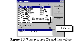
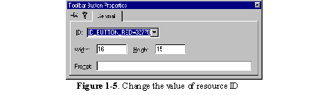
By default, all the resource IDs are defined in file "resource.h". Although we could open it with a text editor and make changes, there is a better way to do so. First, an ID value could be viewed in the Developer Studio by executing View | Resource symbols… command. This command will bring up a dialog box that contains all the resource IDs used by the application (Figure 1-3).
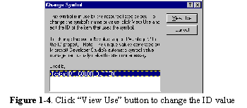
If we want to make change to any ID value, first we need to highlight that ID, then click the button labeled "Change…". After that, a "Change Symbol" dialog box will pop up, if the ID is used for more than one purpose, we need to select the resource type in "Used by" window (This happens when this ID is used for both command ID and string ID, in which case the string ID may be used to implement flyby and tool tip. See Figure 1.9). In our sample, there is only one type of resource that uses the button IDs, so we do not need to make any choice. Now click "View Use" button (Figure 1-4), which will bring up "Toolbar Button Properties" property sheet. Within "General" page, we can change the ID’s value by typing in a new number in the window labeled "ID". For example, if we want to change the value of ID_BUTTON_RED to 32770, we just need to type in an equal sign and a number after the symbolic ID so that this edit window has the following contents (Figure 1-5):ID_BUTTON_RED=32770
Unfortunately, Class Wizard doesn’t do range mappings, so we have to implement it by ourselves. Sample 1.4\Bar demonstrates how to implement this kind of mapping. It is based upon sample 1.2\Bar, which already contains the default message mapping macros:
BEGIN_MESSAGE_MAP(CBarDoc, CDocument)
//{{AFX_MSG_MAP(CBarDoc)
ON_COMMAND(ID_BUTTON_BLUE, OnButtonBlue)
ON_COMMAND(ID_BUTTON_GREEN, OnButtonGreen)
ON_COMMAND(ID_BUTTON_RED, OnButtonRed)
ON_COMMAND(ID_BUTTON_YELLOW, OnButtonYellow)
ON_UPDATE_COMMAND_UI(ID_BUTTON_BLUE, OnUpdateButtonBlue)
ON_UPDATE_COMMAND_UI(ID_BUTTON_GREEN, OnUpdateButtonGreen)
ON_UPDATE_COMMAND_UI(ID_BUTTON_RED, OnUpdateButtonRed)
ON_UPDATE_COMMAND_UI(ID_BUTTON_YELLOW, OnUpdateButtonYellow)
//}}AFX_MSG_MAP
END_MESSAGE_MAP()
The following lists the necessary steps of changing message mapping from the original implementation to using contiguous IDs:
……
……
Please compare the above code with the implementation in section 1.2. When we ask Class Wizard to add message mapping macros, it always adds them between //{{AFX_MSG comments. Actually, these comments are used by the Class Wizard to locate macros. To distinguish between the work done by ourselves and that done by Class Wizard, we can add the statements outside the two comments.
m_wndToolBar.SetBarStyle
(
m_wndToolBar.GetBarStyle() | CBRS_TOOLTIPS | CBRS_FLYBY | CBRS_SIZE_DYNAMIC
);
This allows the size of a tool bar to change dynamically. When the bar is floating or docked to top or bottom border of the client area, the buttons will have a horizontal layout. If the bar is docked to left or right border, they will have a vertical layout.
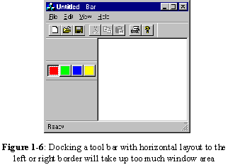
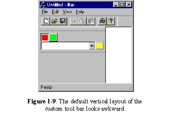
Sometimes we may want to fix the size of the tool bar, and disable the dynamic layout feature. This can be achieved through specifying CBRS_SIZE_FIXED flag instead of CBRS_SIZE_DYNAMIC flag when calling function CToolBar::SetBarStyle(…).By default, the buttons on the tool bar will have a horizontal layout. If we fix the size of the tool bar, its initial layout will not change throughout application’s lifetime. This will cause the tool bar to take up too much area when it is docked to either left or right border of the client area (Figure 1-6).
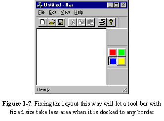
Instead of fixing the layout this way, we may want to wrap the tool bar from the second button, so the width and height of the tool bar will be roughly the same at any time (Figure 1-7).
m_wndColorButton.SetBarStyle
(
m_wndColorButton.GetBarStyle() | CBRS_TOOLTIPS | CBRS_FLYBY | CBRS_SIZE_FIXED
);
);
To avoid losing default styles, in the second step, function CToolBar::GetButtonStyle(…) is first called to retrieve the original styles, which are bit-wise ORed with the new style before calling function CToolBar::SetButtonStyle(…).By default, a tool bar can have only buttons and separators, and all the buttons must have the same size. This prevents us from adding other types of controls to the tool bar. However, by using some special properties of tool bar, we can still manage to add other types of common controls such as combo box to it.
Remember that all controls are actually different type of windows in essence. When we design a dialog template and add different common controls, we are given an impression that these controls are implemented "Statically". In fact, we can create any type of common controls by calling function CWnd::Create(…) at any time. This member function is supported by all the classes that are derived from CWnd. We can use it to create a control and put it anywhere on the tool bar.Dynamically creating window is rarely used in normal programming because in this case the programmer has to calculate the size and position of the window carefully. If we implement this from a dialog template, we can see the visual effect immediately after a new control is added. If we implement this through function calling, we have to compile the project before we can see the final result.
However, because tool bar resource does not let us add controls other than buttons, dynamic method is the only way we can pursue to implement combo box on the tool bar. The question here is: because the buttons are positioned side by side, where can we put a combo box that will definitely take up a larger area?
To prevent the controls from interfering with each other, one control should not overlap another. So first, we must find an inactive area on the tool bar where we could create the combo box.
On the tool bar, separator is an inactive control. If we click mouse on it, there will be no response. We already know that we can call function CToolBar::SetButtonInfo(…) to change a button to a separator. Also, when doing this, we can specify the width of the separator by using iImage parameter (when we pass TBBS_SEPARATOR to nStyle parameter, the meaning of iImage parameter becomes the width of the separator).On top of the separator, we can create any controls using dynamic method.
Sample 1.6\Bar demonstrates how to add combo box to the tool bar. This sample is based upon sample 1.4\Bar. In the new sample, the third button (blue button) is changed to a combo box. The following lists necessary steps of implementing this:
……
……
BOOL CComboBox::Create(DWORD dwStyle, const RECT& rect, CWnd* pParentWnd, UINT nID);
We can use the first parameter to set the styles of a combo box. A combo box can have different styles, in our sample, we just want to create a very basic drop down combo box (For other types of combo boxes, see Chapter 5). The following code fragment shows how this function is called within CMainFrame:: OnCreate(…):……
m_wndColorButton.SetButtonInfo(2, ID_BUTTON_BLUE, TBBS_SEPARATOR, 150);
m_wndColorButton.GetItemRect(2, rect);
rect.bottom=rect.top+150;
if(!m_wndComboBox.Create(WS_CHILD | CBS_DROPDOWN |
CBS_AUTOHSCROLL | WS_VSCROLL | CBS_HASSTRINGS,
rect, &m_wndColorButton, ID_BUTTON_BLUE))
{ return -1;
}
m_wndComboBox.ShowWindow(SW_SHOW);
……
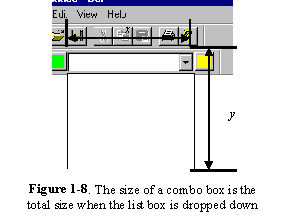
Function CToolBar::GetItemRect(…) is called in the second statement of above code to retrieve the size and position of the separator. After calling this function, the information is stored in variable rect, which is declared using class CRect.A drop down combo box contains two controls: an edit box and a list box. Normally the list box is not shown. When the user clicks on the drop down button of the combo box, the list box will be shown. Because the size of the combo box represents its total size when the list box is dropped down (Figure 1-8), we need to extend the vertical dimension of the separator before using it to set the size of the combo box. The third statement of above code sets the rectangle’s vertical size to 150. So when our combo box is dropped down, its width and the height will be roughly the same.
The fourth statement of above code creates the combo box. Here a lot of styles are specified, whose meanings are listed below:
Style Flag |
Meanings |
WS_CHILD |
Indicates that the window (combo box) being created is a child window. We must specify this flag in order to embed the combo box in another window |
CBS_DROPDOWN |
The combo box has a list control that can be dropped down by clicking its drop down button |
CBS_AUTOHSCROLL |
When the user types text into the edit control, the text will be automatically scrolled to the left if it is too long to be fully displayed |
WS_VSCROLL |
If too many items are added to the list controls and not all of them can be displayed at the same time, a vertical scroll bar will be added to the list control |
CBS_HASSTRINGS |
The items in the list control contains strings |
The above styles are the most commonly used ones for a combo box. For details about this control, please refer to chapter 5.
Because the combo box does not fit well when the tool bar has a vertical layout, we may want to change it back to the blue button when the tool bar is docked to the left or right border, and change the button back to combo box again when the bar is floated or docked to the top or bottom border.
This can be easily implemented by calling function CToolBar::SetButtonStyle(…) back and forth and setting the button’s style according to the current layout. The problem here is that we must be notified when the tool bar’s layout is about to change so that we can call the above function before the layout of tool bar actually changes. When a tool bar’s layout is about to change, function CToolBar::CalcDynamicLayout(…)will be called to retrieve the dimension of the tool bar. The default implementation of this function calculates the tool bar layout according to the sizes of the controls contained in the tool bar and tries to arrange them to let the tool bar have a balanced appearance. What we could do here is changing the combo box back to the button when this function is called for calculating tool bar’s vertical layout size, and changing the button back to combo box when it is called for calculating the horizontal layout size. We could override function CToolBar::CalcDynamicLayout(…)to make this change. The new function should be implemented as follows:Overridden CalcDynamicLayout(…)
{
Change the combo box to button or vice versa if necessary;
CToolBar::CalcDynamicLayout(…);
}
The default implementation of this function is called after the button information is set correctly. By doing this way, the tool bar can always have the best layout appearance.
CSize CControlBar::CalcDynamicLayout(int nLength, DWORD dwMode);
The function has two parameters, the second parameter dwMode indicates what kind of size is being retrieved. It can be the combination of many flags, in this section, we need to know only two of them:Flag |
Meanings |
| LM_HORZDOCK | The horizontal dock dimension is being retrieved |
| LM_VERTDOCK | The vertical dock dimension is being retrieved |
class CColorBar : public CToolBar
{
public:
CColorBar();
BOOL AddComboBox();
BOOL ShowComboBox();
BOOL HideComboBox();
virtual ~CColorBar();
virtual CSize CalcDynamicLayout(int , DWORD);
//{{AFX_VIRTUAL(CColorBar)
//}}AFX_VIRTUAL
protected:
CComboBox m_wndComboBox;
//{{AFX_MSG(CColorBar)
//}}AFX_MSG
DECLARE_MESSAGE_MAP()
};
Instead of declaring a CComboBox type variable in class CMainFrame, here we implement the declaration in the derived class. This is a better implementation because the combo box should be made the child window of the tool bar. By embedding the variable here, we can make it a protected variable so that it is not accessible from outside the class. Three functions are added to change the tool bar’s style. Function CColorBar::AddComboBox() changes the blue button to a separator and creates the combo box window:BOOL CColorBar::AddComboBox()
{
CRect rect;
GetItemRect(2, rect);
rect.bottom=rect.top+150;
if
(
!m_wndComboBox.Create
(
WS_CHILD | CBS_DROPDOWN | CBS_AUTOHSCROLL | WS_VSCROLL | CBS_HASSTRINGS,
rect,
this,
ID_BUTTON_BLUE
)
)return FALSE;
else return TRUE;
}
This is the same with what we did in function CMainFrame::OnCreate(…) in the previous section. The only difference is that when creating the combo box within the member function of CMainFrame, the combo box’s parent window needs to be set to m_wndColorButton. Here, since the combo box variable is embedded in the parent window’s class, we need to use this pointer to indicate the parent window. Function CColorBar::ShowComboBox() and CColorBar::HideComboBox() change the combo box to the button and vice versa. They should be called just before the default layout is about to be carried out:BOOL CColorBar::ShowComboBox()
{
CRect rect;
SetButtonInfo(2, ID_BUTTON_BLUE, TBBS_SEPARATOR, 150);
if(m_wndComboBox.m_hWnd != NULL)
{
m_wndComboBox.ShowWindow(SW_SHOW);
}
return TRUE;
}
BOOL CColorBar::HideComboBox()
{
SetButtonInfo(2, ID_BUTTON_BLUE, TBBS_BUTTON, 2);
if(m_wndComboBox.m_hWnd != NULL)m_wndComboBox.ShowWindow(SW_HIDE);
return TRUE;
}
Finally, function CalcDynamicLayout(…) is overridden as follows:CSize CColorBar::CalcDynamicLayout(int nLength, DWORD dwMode)
{
if(dwMode & LM_HORZDOCK)ShowComboBox();
else HideComboBox();
return CToolBar::CalcDynamicLayout(nLength, dwMode);
}
Before calling the base class version of this function, we examine LM_HORZDOCK bit of dwMode parameter, if it is set, we call function CColorBar::ShowComboBox() to change the button to the combo box. If not, we call function CColorBar::HideComboBox() to change the combo box back to the default button. It is relatively easy to use this class: we just need to include the header file of CColorBar class in file "MainFrm.h", then change the prototype of m_wndColorBar from CToolBar to CColorBar. Because the combo box is embedded in CColorBar class, we need to remove variable wndComboBox declared in the previous section. In function CMainFrame::OnCreate(), instead of creating the combo box by ourselves, we can just call the member function of CColorBar. Here is how the combo box is created using this new method:……
m_wndColorButton.AddComboBox();
m_wndColorButton.ShowComboBox();
……
We can see that the original five statements have been reduced to two statements.
Now we can compile and execute the sample again to see the behavior of the combo box.
As we have noticed, the limitation of the tool bar is that when we design a tool bar from resource, only bitmap buttons with the same size can be included. If we try to modify the size of one bitmap button, the size of all other buttons will be automatically adjusted. If we want to include controls other than buttons, we need to write code to add them dynamically.
If we want to implement a control bar that contains other types of common controls starting from resource editing, we need to use another type of control bar: dialog bar. In MFC, the class that can be used to implement this type of control bar is CDialogBar.Like tool bar, dialog bar is also derived from control bar. Both of them share some common features. For example, both types of control bars can be either docked or floated, and they all support tool tip and flyby implementation. The difference between tool bar and dialog bar is that they are designed to contain different types of controls: while tool bar is more suitable for containing a row of bitmap buttons with the same size, dialog bar can be implemented to contain any type of controls that can be used in a dialog box.
Implementing dialog bar is similar to that of dialog box. The first step is to design a dialog-template resource. We can add buttons, edit boxes, combo boxes, even animate controls to a dialog bar.
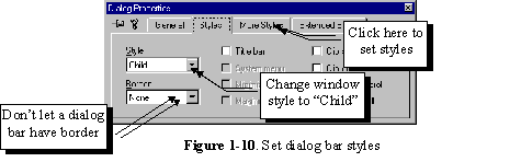
Dialog bar shares the same type of resource with dialog box. So when starting to create resource for dialog bar, we first need to add a "dialog" type resource to the application (In order to do this, we can execute Insert | Resource… command, then select "Dialog" from the popped up "Insert Resource" dialog box). When specifying the dialog properties, we must set "child" and "no border" styles. This can be customized in "Dialog Properties" property sheet (Figure 1-10).
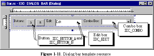
Sample 1.8\Bar demonstrates how to use dialog bar, it is based on sample 1.7\Bar. In this sample, besides the extra tool bar added in the previous sections, a new dialog bar that contains some common controls is added to the application. The resource ID of this dialog bar is ID_DIALOG_BAR. It contains two push buttons (ID_BUTTON_A, ID_BUTTON_B), one edit box (IDC_EDIT) and one combo box (IDC_COMBO). Also, there are other three static text controls (Figure 1-11). Adding a dialog bar to the application is similar to that of a tool bar. First we need to declare a variable in class CMainFrame. Then within function CMainFrame::OnCreate(…), we can call the member functions of CDialogBar and CFrameWnd to create the dialog bar, set its styles and dock it.The following lists necessary steps of adding this dialog bar:
……
……
……
Because dialog bar can contain more powerful controls than tool bar, we could use it to implement control bars with more flexibility. To make user-friendly interface, sometimes we may really want to dynamically change a dialog bar’s size.
Class CControlBar has two member functions dealing with control bar layout: CControlBar:: CalcFixedLayout(…) and CControlBar::CalcDynamicLayout(…). The first function returns the fixed size of a control bar, which is determined from the resource of a control bar. The second function is designed for implementing dynamic layout, however in class CControlBar, this function does noting but calling CControlBar::CalcFixedLayout(…). So actually CControlBar does not have dynamic layout feature. Class CToolBar overrides function CControlBar::CalcDynamicLayout(…), which adjusts the size of control bar according to its current docking state and the size of buttons. Whenever its docking state is changed, this function will be called to obtain the information of a tool bar before its layout is changed accordingly. With this implementation, a tool bar can always have a balanced appearance. Unlike CToolBar, CDialogBar does not override this function, so when the docking state of a dialog bar is changed, the default CControlBar::CalcDynamicLayout(…) is called, which of course, will not perform any dynamic layout for the dialog bar. If we want to add any dynamic layout feature, we must override this member function. Sample 1.9\Bar demonstrates how to build a dialog bar that can be resized dynamically. The application is a standard SDI application generated from Application Wizard, with four classes named CBarApp, CMainFrame, CBarDoc, and CBarView. In the sample, a dialog bar with an edit control is added to the application. This dialog bar will support dynamic layout feature: when we float or dock it to different borders of the mainframe window, the size of the dialog bar will change accordingly.Deriving New Class from CDialogBar
To implement dialog bar, first we need to add a dialog-template resource. In the sample, the ID of the new resource is IDD_DIALOGBAR, which contains an edit box. The ID of this edit box is IDC_EDIT, it supports multiple-line editing. To enable this style, first we can open "Edit Properties" property sheet of the edit control (To invoke this property sheet, when editing the dialog template, we can double click on the edit control or right click on it and move to "Properties" menu item), then we need to click "Styles" tab and check "Multiline" check box. To override the default function, first we need to derive a new class from CDialogBar. The following code fragment shows the derived class MCDialogBar, which resides in file "MDlgBar.h":class MCDialogBar : public CDialogBar
{
public:
MCDialogBar();
//{{AFX_DATA(MCDialogBar)
//}}AFX_DATA
virtual CSize CalcDynamicLayout(int, DWORD);
//{{AFX_VIRTUAL(MCDialogBar)
//}}AFX_VIRTUAL
protected:
//{{AFX_MSG(MCDialogBar)
afx_msg void OnSize(UINT nType, int cx, int cy);
//}}AFX_MSG
DECLARE_MESSAGE_MAP()
};
Besides constructor, the only things included in this class are two functions. As we already know, MCDialogBar::CalcDynamicLayout(…) will be used to support dynamic layout. Another afx_msg type function MCDialogBar::OnSize(…) is a message handler, which will be used to resize the edit control contained in the dialog bar. By doing this, we can see that whenever the size of the dialog bar is adjusted, the size of the edit box will also change accordingly. This will let the edit box fit well within the dialog bar. The new class can be added by opening new files (".h" and ".cpp" files) and typing in the new class and function implementations. Then we can execute Project | Add To Project | Files… command to add the newly created files to the project. However, if we do so, we can not use Class Wizard to add member variables and functions to the class. In this case, we need to implement message mapping manually. If this is our choice, we must make sure that DECLARE_MESSAGE_MAP() macro is included in the class, and BEGIN_MESSAGE_MAP, END_MESSAGE_MAP macros are included in the implementation file (".cpp" file) so that the class will support message mapping. We can also use Class Wizard to add new class. In order to do this, after invoking the Class Wizard, we can click button labeled "Add Class…" then select "New…" from the popup menu. This will invoke a dialog box that lets us add a new class to the project. We can type in the new class name, select the header and implementation file names, and designate base class name. Unfortunately, CDialogBar is not in the list of base classes. A workaround is that we can select CDialog as the base class, after the class is generated, delete the unnecessary functions, and change all CDialog keywords to CDialogBar in both header and implementation files. The edit control should be resized whenever the size of its parent window changes. In order to do this, we can trap WM_SIZE message, which is sent to a window when its size is about to change. We need to declare an afx_msg type member function as the message handler, and implement the message mapping using ON_WM_SIZE macro. The message handler of WM_SIZE should have the following format:afx_msg void OnSize(UINT nType, int cx, int cy);
Here nType indicates how the window’s size will be changed (is it maximized, minimized…), cx and cy indicate the new window size.It is not very difficult to add message mapping macro, we can either add it manually, or ask Class Wizard to do it for us:
BEGIN_MESSAGE_MAP(MCDialogBar, CDialogBar)
//{{AFX_MSG_MAP(MCDialogBar)
ON_WM_SIZE()
//}}AFX_MSG_MAP
END_MESSAGE_MAP()
Please note that we do not need to specify function name when using macro ON_WM_SIZE. Instead, we must use OnSize to name the message handler of WM_SIZE. To change a window’s size, we can call function CWnd::MoveWindow(…):void CWnd::MoveWindow(int x, int y, int nWidth, int nHeight, BOOL bRepaint=TRUE);
We need to provide new position and size in order to call this function. Because the function is a member of CWnd, we need to first obtain a pointer to the edit window then use it to call this function. For controls contained in a dialog box, their window pointers can be obtained by calling function CWnd::GetDlgItem(…). This function requires a valid control ID:CWnd *CWnd::GetDlgItem(int nID);
The function returns a CWnd type pointer. With this pointer, we can call any member functions of CWnd to retrieve its information or change the properties of the control. Because we want to set the edit control’s size according to the parent window’s size (dialog bar), we need to find a way of retrieving a window’s dimension. This can be implemented by calling another member function of CWnd:void CWnd::GetClientRect(LPRECT lpRect);
It is very easy to use this function. We can just declare a CRect type variable, and pass its pointer to the above function when calling it. After this, the position and size of the window will be stored in the variable. The following shows how message WM_SIZE is handled in the sample:void MCDialogBar::OnSize(UINT nType, int cx, int cy)
{
CWnd *ptrWnd;
CRect rectWnd;
CDialogBar::OnSize(nType, cx, cy);
GetClientRect(rectWnd);
ptrWnd=GetDlgItem(IDC_EDIT);
if(ptrWnd != NULL)
{
ptrWnd->MoveWindow
(
rectWnd.left+15,
rectWnd.top+15,
rectWnd.Width()-30,
rectWnd.Height()-30
);
}
}
We can not use parameter cx and cy to resize the edit control directly because after the dialog bar gets this information, its layout may change again. The ultimate dimension of the dialog bar depends on both cx, cy and the layout algorithm. So before adjusting the size of edit control, we have to call CDialogBar::OnSize(…) first to let the dialog bar adjust its own size, then call CWnd::GetClientRect(…) to retrieve the final dimension of the dialog bar. The rest part of this function can be easily understood: we first obtain a window pointer to the edit control and store it in pointer ptrWnd, then use it to call function CWnd::MoveWindow(…) to resize the edit control. Now we need to implement function MCDialogBar::CalcDynamicLayout(…). Like what we did in section 1.7, here we need to return a custom layout size when the function is called for retrieving either horizontal or vertical docking size. The following is our layout algorithm: when the bar is docked horizontally, we set its width to the horizontal size of the mainframe window’s client area, and set its height to the dialog bar’s floating vertical size; when it is docked vertically, we set its height to the vertical size of the mainframe window’s client area, and set its width to the dialog bar’s floating horizontal size. Parameter dwMode of this function is used to tell what types of dimension is be inquired. If either LM_VERTDOCK or LM_HORZDOCK bit is set, we need to return a custom docking size. In this case, we can use another bit LM_HORZ to check if the dialog bar is docked horizontally or vertically. If this bit is set, the horizontal docking size is being inquired, otherwise the vertically docking size is being inquired. The floating size can be obtained from a public variable: CDialogBar::m_sizeDefault. By default, this variable is initialized to the dialog template size, and is updated when the user changes the size of the dialog bar when it is floating. So this variable always represents the floating size of the dialog bar.The following is the implementation of this function:
CSize MCDialogBar::CalcDynamicLayout(int nLength, DWORD dwMode)
{
CSize size;
CMainFrame *ptrWnd;
CRect rect;
ptrWnd=(CMainFrame *)(AfxGetApp()->m_pMainWnd);
ptrWnd->GetClientRect(rect);
if((dwMode & LM_VERTDOCK) || (dwMode & LM_HORZDOCK))
{
size.cx=(dwMode & LM_HORZ) ? rect.Width():m_sizeDefault.cx;
size.cy=(dwMode & LM_HORZ) ? m_sizeDefault.cy:rect.Height();
return size;
}
return CDialogBar::CalcDynamicLayout(nLength, dwMode);
}
First, we obtain the dimension of mainframe window’s client area. For this purpose, first a window pointer to the mainframe window is obtained, then function CMainFrame::GetClientRect(…) is called to retrieve its dimension. Here the pointer to the mainframe window is obtained from a public member variable of class CWinApp. In MFC, every application has a CWinApp derived class, which contains a pointer m_pMainWnd pointing to the mainframe window. For any application, the pointer to the CWinApp object can be obtained anywhere in the program by calling function AfxGetApp(). Using this method, we can easily find the mainframe window of any MFC application. Because the application supports status bar and tool bar, part of its client area may be covered by the control bar. So we need to deduct the covered area when calculating the dimension of the client area. For this purpose, in CMainFrame, function CWnd::GetClientRect(…) is overridden. Within the overridden function, the client area is adjusted if either the status bar or the tool bar is present:void CMainFrame::GetClientRect(LPRECT lpRect)
{
CRect rect;
CFrameWnd::GetClientRect(lpRect);
if(m_wndToolBar.IsWindowVisible())
{
m_wndToolBar.GetClientRect(rect);
lpRect->bottom-=rect.Height();
}
if(m_wndStatusBar.IsWindowVisible())
{
m_wndStatusBar.GetClientRect(rect);
lpRect->bottom-=rect.Height();
}
}
Now back to MCDialogBar::CalcDynamicLayout(…) implementation. After obtaining the size of mainframe window’s client area, we examine LM_VERTDOCK and LM_HORZDOCK bits of dwMode parameter to see if the docking size is being inquired. If so, we further examine LM_HORZ bit to see if we should return horizontally docked size or vertically docked size. We return different sizes for different cases. For all other conditions, we just return the default implementation of the base class. To use this class, first we need to declare a MCDialogBar type variable in class CMainFrame. We also need to make sure that the header file of this class is included. In the sample application, this new variable is m_wndDialogBar. Then, as we have experienced many times, we need to create the window of the dialog bar in function CMainFrame::OnCreate(…). When doing this, we need to specify CBRS_SIZE_DYNAMIC flag in order to let the dialog bar be resized dynamically. Then we can call CDialogBar::EnableDocking(…), CDialogBar::SetBarStyle(…) and CMainFrame::DockControlBar(…) to set styles and implement docking.Now we can compile and execute the new project. Originally, the dialog bar is docked at the bottom border of the frame window. We may drag and dock it to any other border, or make it floating. As we do this, the dimension of the dialog bar will be adjusted automatically to suit different docking styles. Also, the edit control contained in the dialog bar will be resized dynamically according to the change on the dialog bar.
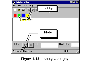
Flyby and tool tip are two very nice features that can be added to both tool bar and dialog bar. If we enable these features, when the user moves mouse cursor over a control contained in tool bar or dialog bar and stay there for a while, a describing text about this control will appear on the status bar (It is called Flyby). At the same time, a small window with a short description will pop up (It is called Tool Tip. See Figure 1-12 for two types of controls).
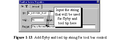
Adding this string for tool bar buttons is very easy. By opening the property sheet "Toolbar Button Properties", we will find an edit box labeled "Prompt". Inputting a string into this edit box will add the string resource automatically (Figure 1-13).
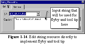
For dialog bar, we don’t have the place to input this string in the property sheet. So we need to edit string resource directly. This can also be implemented very easily. In the Developer Studio, if we execute command Insert | Resource…(or press CTRL+R keys), an "Insert Resource" dialog box will pop up. To add a string resource, we need to highlight node "String Table" and press "New" button. After this, a new window with the string table will pop up. By scrolling to the bottom of the window and double clicking an empty entry, a "String Properties" property sheet will pop up, which can be used to add a new string resource (Figure 1-14).
Sample 1.10\Bar demonstrates how to implement flybys and tool tips. It is based on sample 1.8\Bar. Actually, the only difference between the two projects is that some new string resources are added to sample 1.10\Bar. In sample 1.10\Bar, following string resources are added:
String ID |
String Contents |
| IDC_COMBO | This is combo box\nCombo Box |
| IDC_EDIT | This is edit box\nEdit Box |
| IDC_BUTTONA | This is button A\nButton A |
| IDC_BUTTONB | This is button B\nButton B |
| ID_BUTTON_RED | This is the red button\nRed Button |
| ID_BUTTON_GREEN | This is the green button\nGreen Button |
| ID_BUTTON_BLUE | This is the blue button\nBlue Button |
| ID_BUTTON_YELLOW | This is the yellow button\nYellow Button |
After executing this sample, we can put the mouse cursor over the controls contained in the tool bar or dialog bar. By doing this, the flyby and tool tip will pop up after the cursor stays there for a short while.
void CFrameWnd::ShowControlBar(CControlBar* pBar, BOOL bShow, BOOL bDelay);
This function has three parameters: the first one is a pointer to the control bar that we want to turn on or off. The second is a Boolean type variable. If it is TRUE, the control bar will be turned on; if it is FALSE, the control bar will be turned off. The third parameter is also Boolean type, it specifies if this action should be taken immediately.
Because we need to know the current state of the control bar (on or off) to determine whether we should hide or show it, we need to call another member function of CWnd to see if the control bar is currently hidden:BOOL CWnd::IsWindowVisible( );
This function returns a TRUE or FALSE value, from which we know the control bar’s current state.
Sample 1.11\Bar supports this new feature, it is based on sample 1.10\Bar. For both tool bar and dialog bar, a new command is added to the main menu, which can be used to toggle the control bar between on and off state.
The following shows necessary steps for implementing the new commands:
With the above implementations, the application can be executed again. We can dismiss the control bar either by executing menu command or by clicking "X" button located at the upper-right corner of the control bar when it is floating. In both cases, the control bar can be turned on again by executing corresponding menu command. We can also dock or float the control bar and turn it off, and see if the original state will remain unchanged after it is turned on later.